
ZAKS BEEF JERKY
As a premium beef jerky product, the client was looking to achieve an updated look — while still paying homage to its rugged roots. It was vital the packaging retained some bull imagery to tie in with the existing theme of the brand, and the flavours needed to be bold and distinct. The line was also expanding from their ‘Slab’ style jerky, to a new ‘Traditional’ jerky line to compliment it — therefore two distinct looks within the same family were needed. Given the previous ‘Slab’ labels were predominately red, additional red accents were worked into the ‘Slab’ products for some continuance from previous product generations. The ‘Traditional’ on the other hand, was given more grey and black accents for added contrast. A revised word-mark logo was created for the Zaks brand to complete the ‘modern vintage’ look desired, along with some strong pops of accent colour to differentiate flavours. With that, the old look rode into the sunset — and a new identity took the reins.
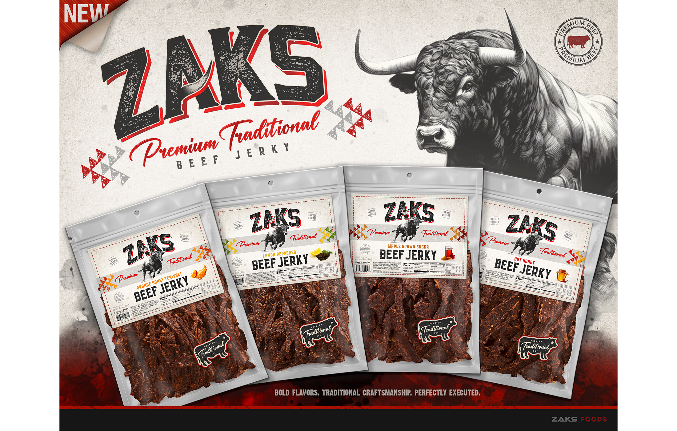
Zaks Beef Jerky - Rebrand Flyer (USA)
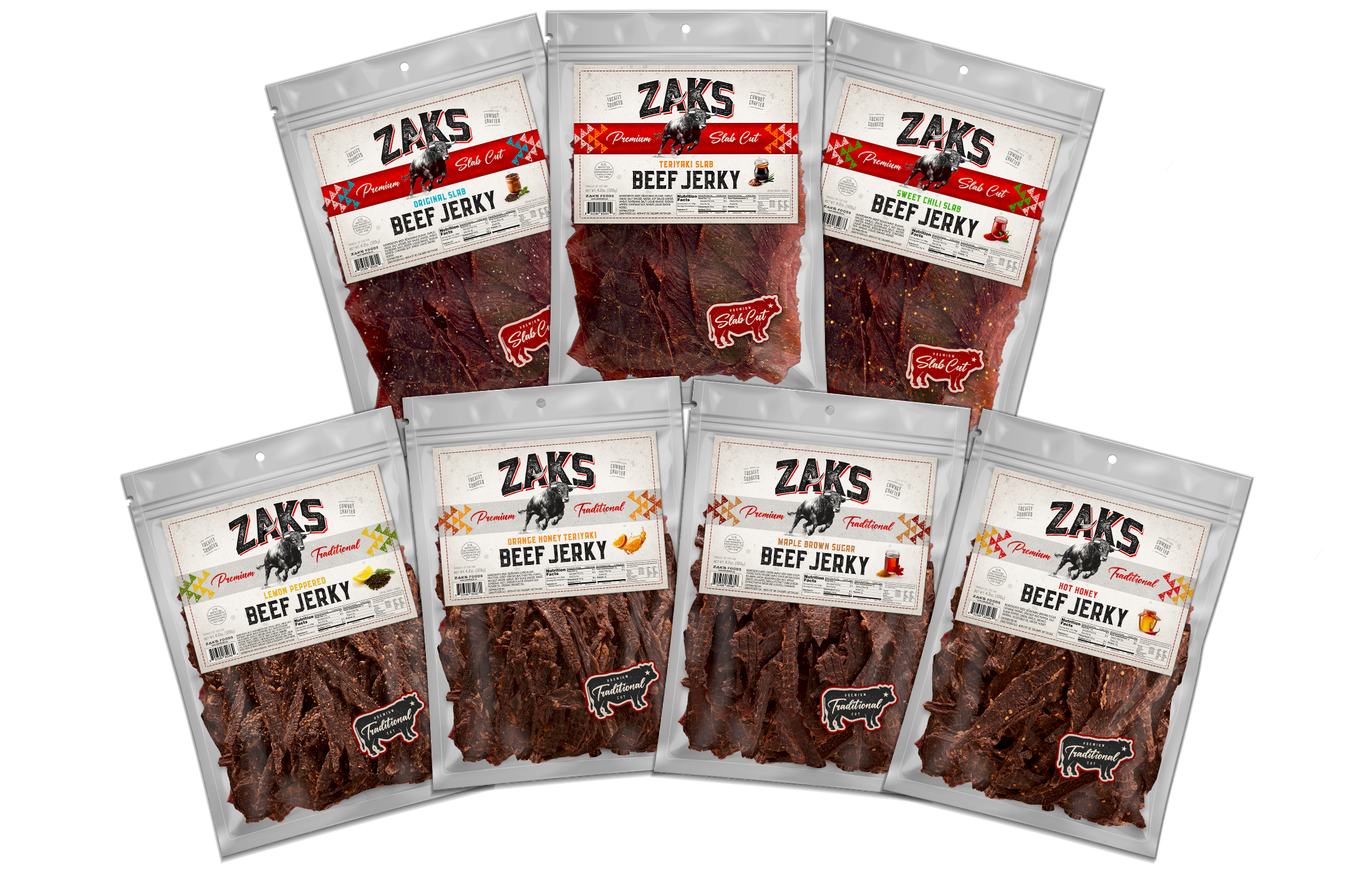
Zaks Beef Jerky - Rebranded Packaging (USA)
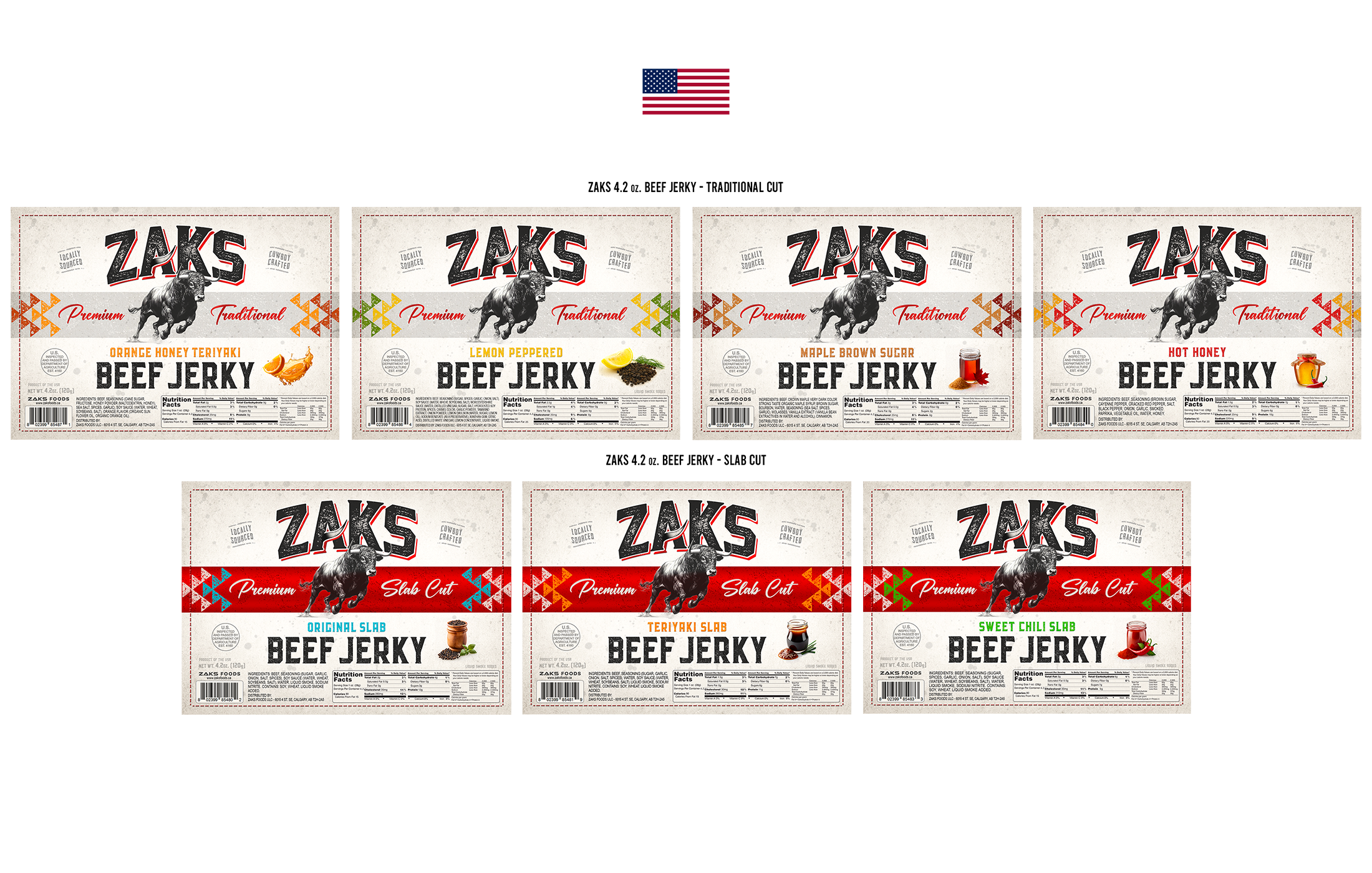
Zaks Beef Jerky - Label Lineup (USA)
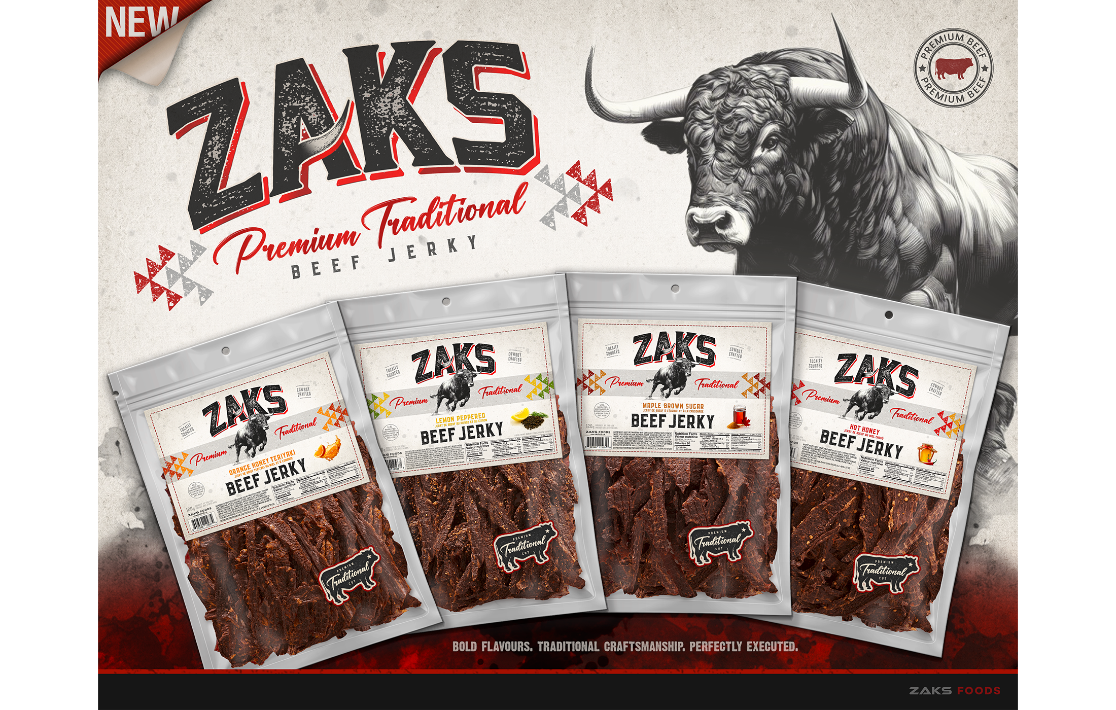
Zaks Beef Jerky - Rebrand Flyer (Canada)
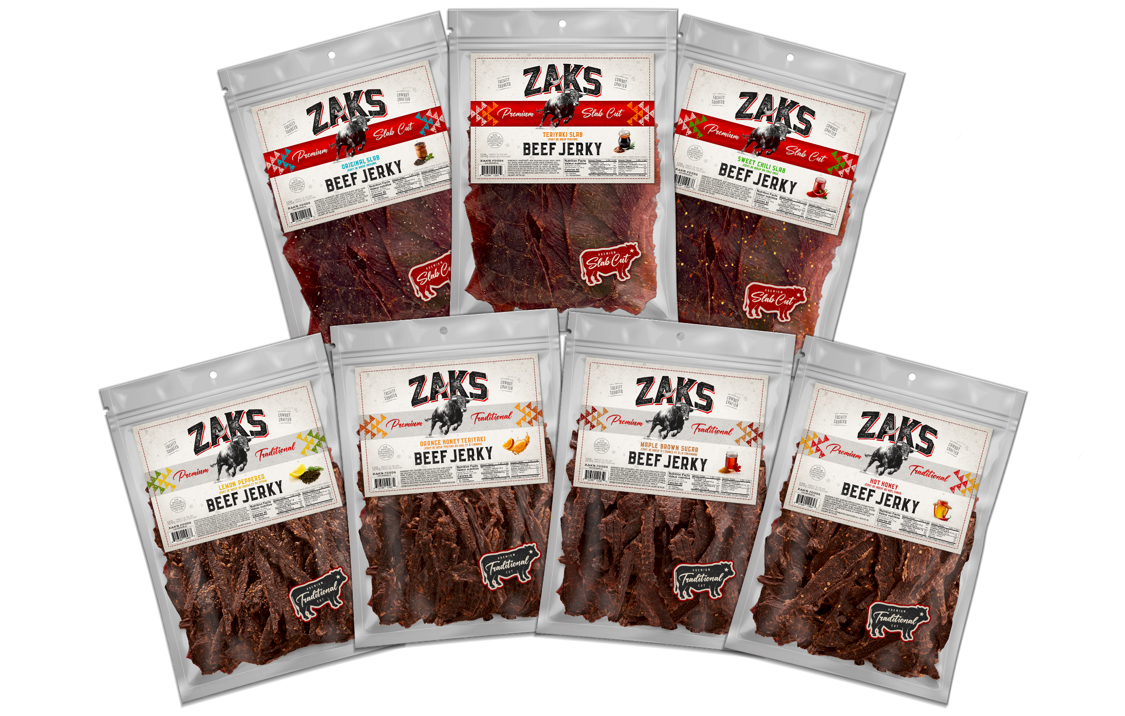
Zaks Beef Jerky - Rebranded Packaging (Canada)
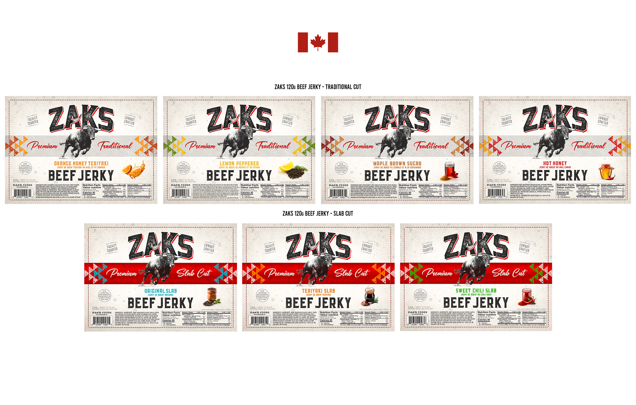
Zaks Beef Jerky - Label Lineup (Canada)
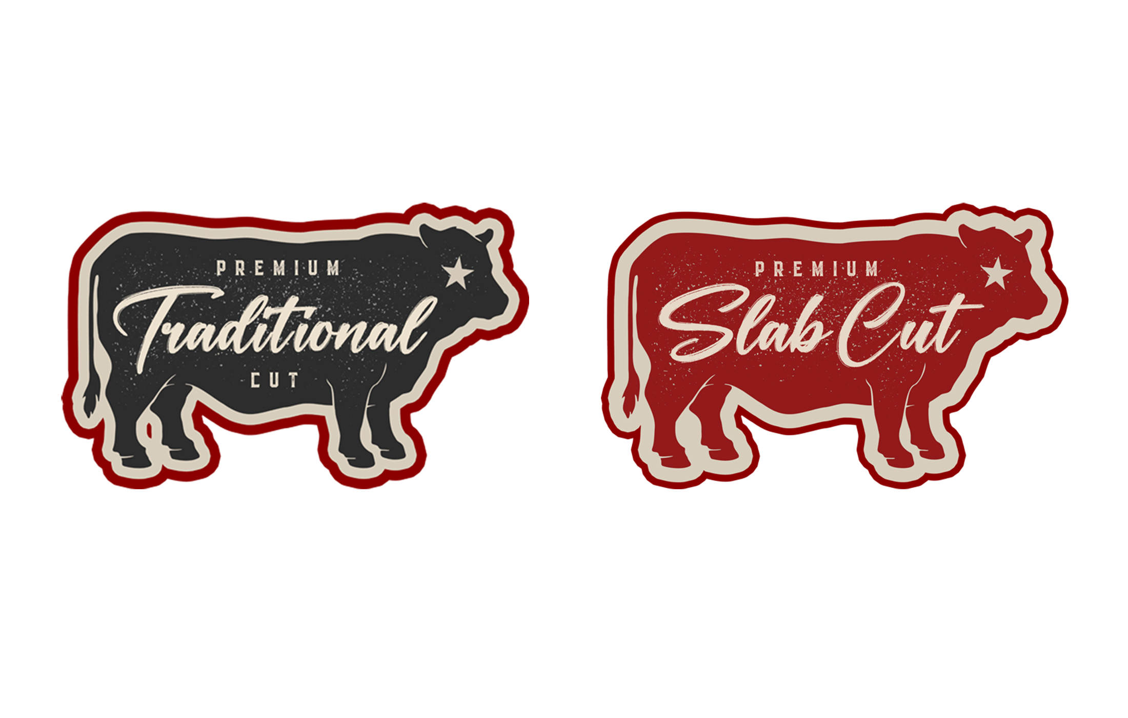
Angus Bag Accent Stickers - Traditional/Slab
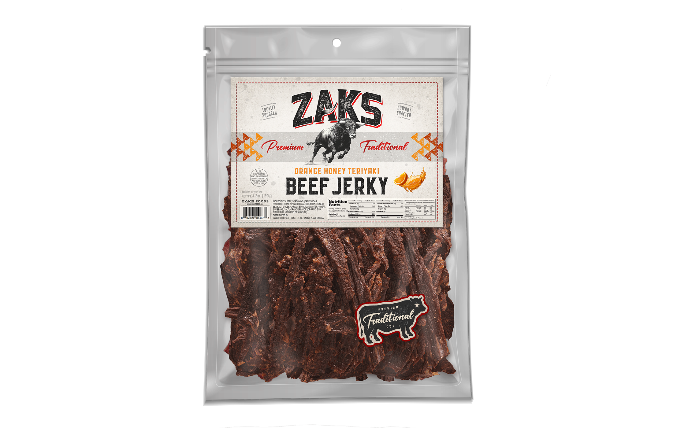
Zaks Traditional Jerky Canada (various)
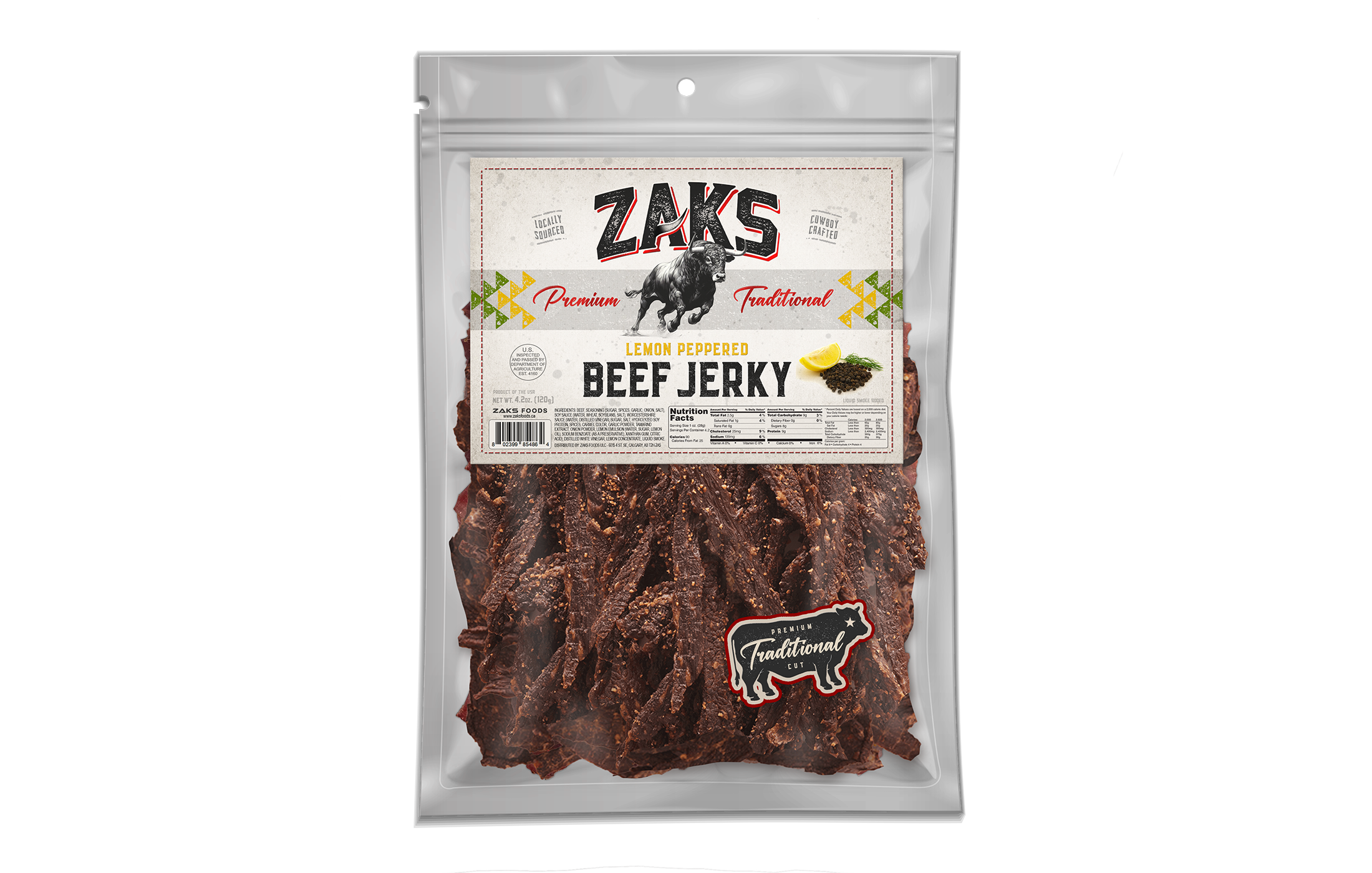
Zaks Traditional Jerky Canada (various)
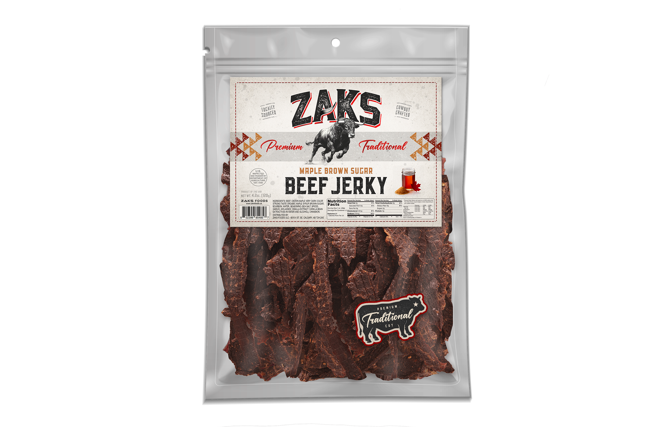
Zaks Traditional Jerky Canada (various)
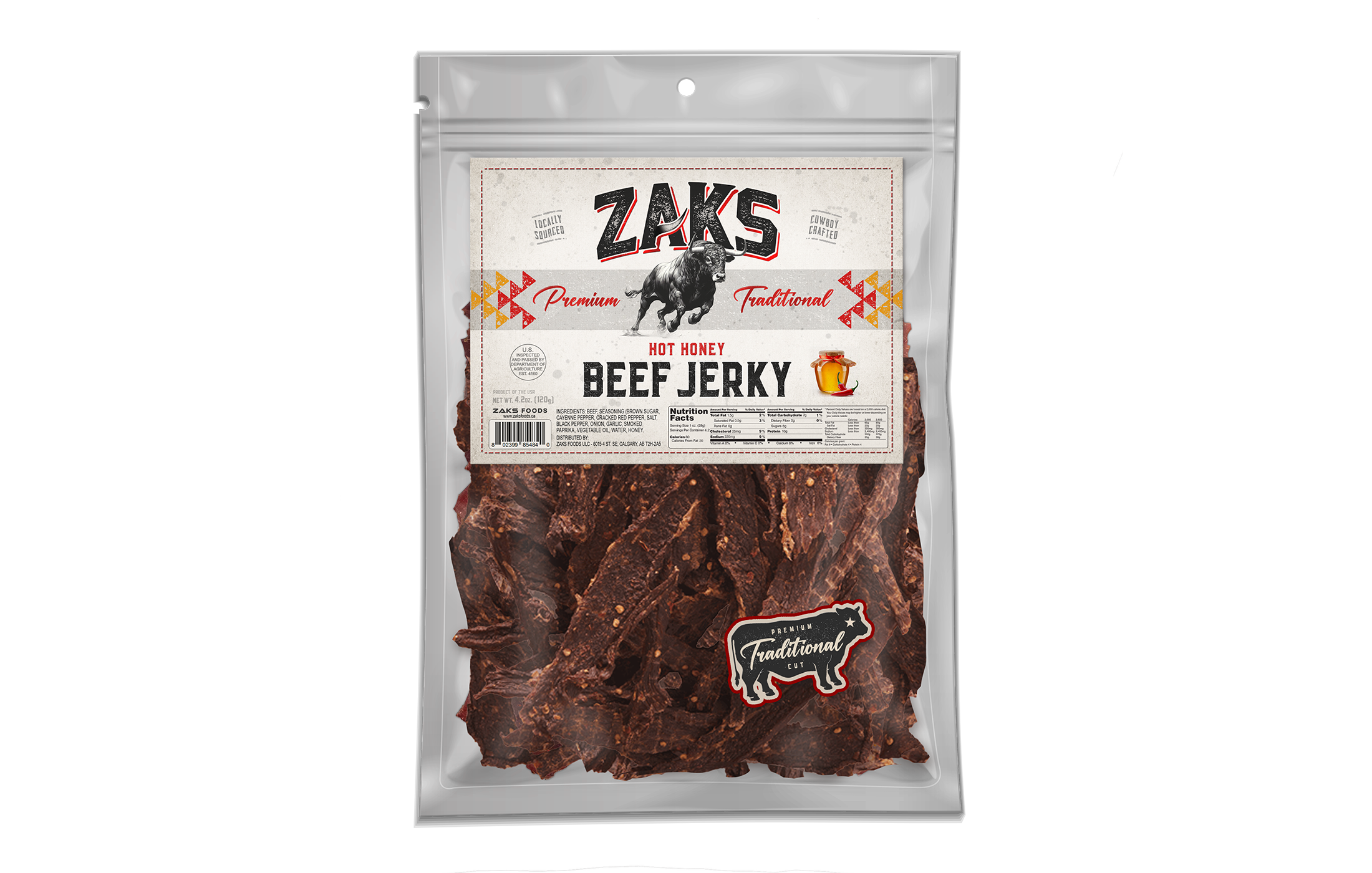
Zaks Traditional Jerky Canada (various)
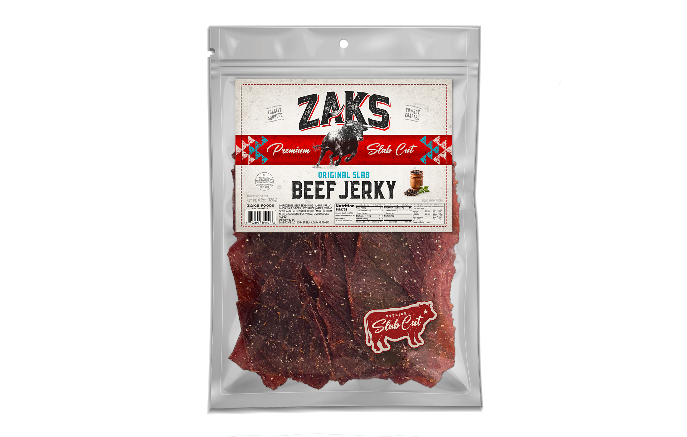
Zaks Slab Jerky Canada (various)
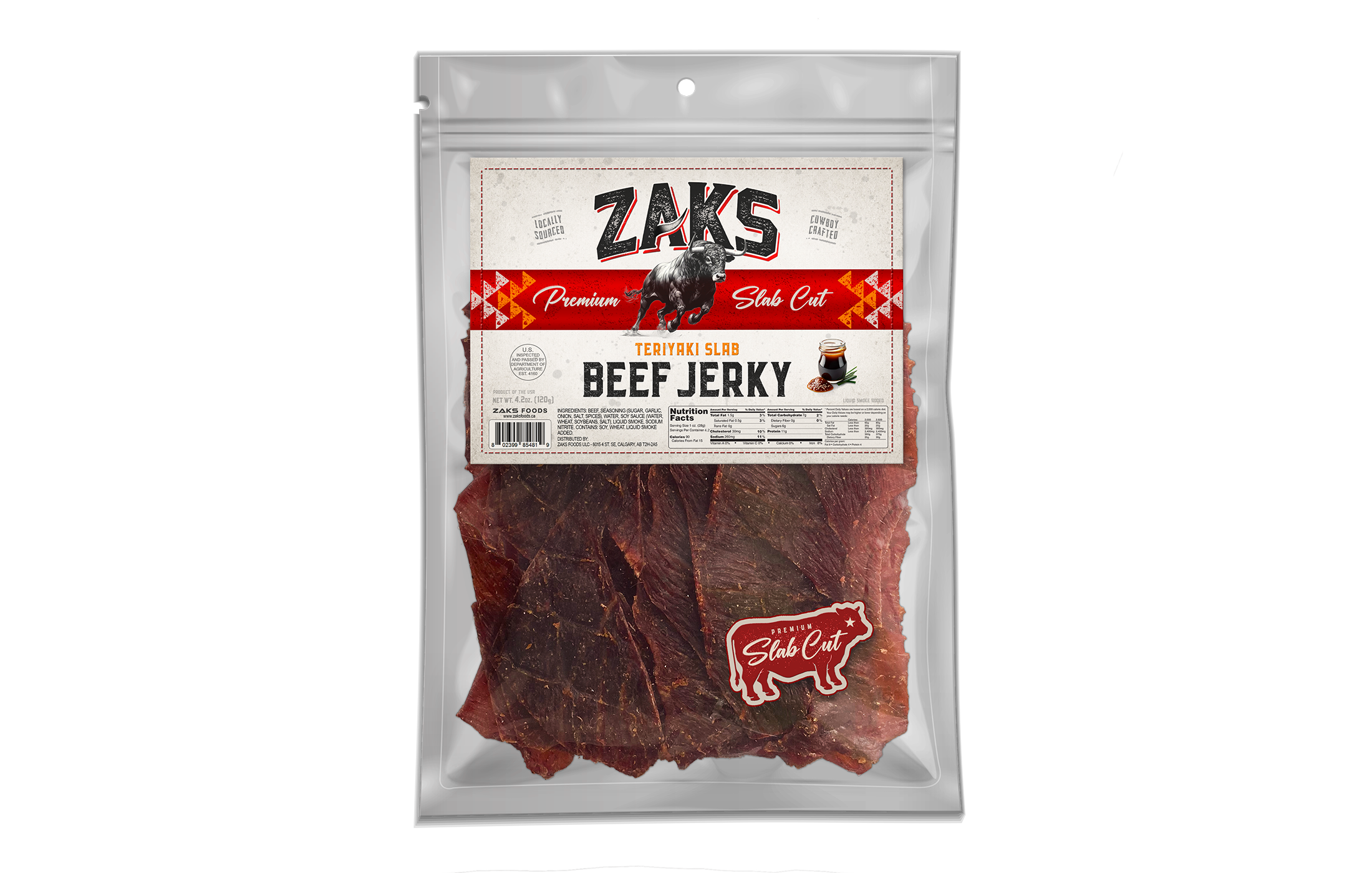
Zaks Slab Jerky Canada (various)
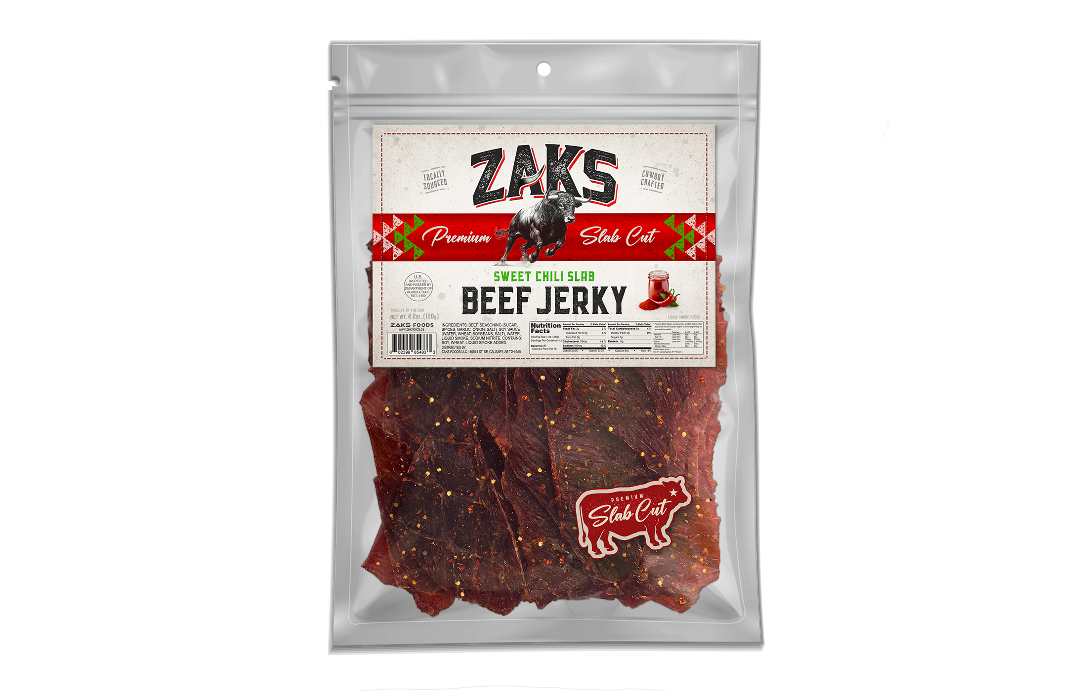
Zaks Slab Jerky Canada (various)
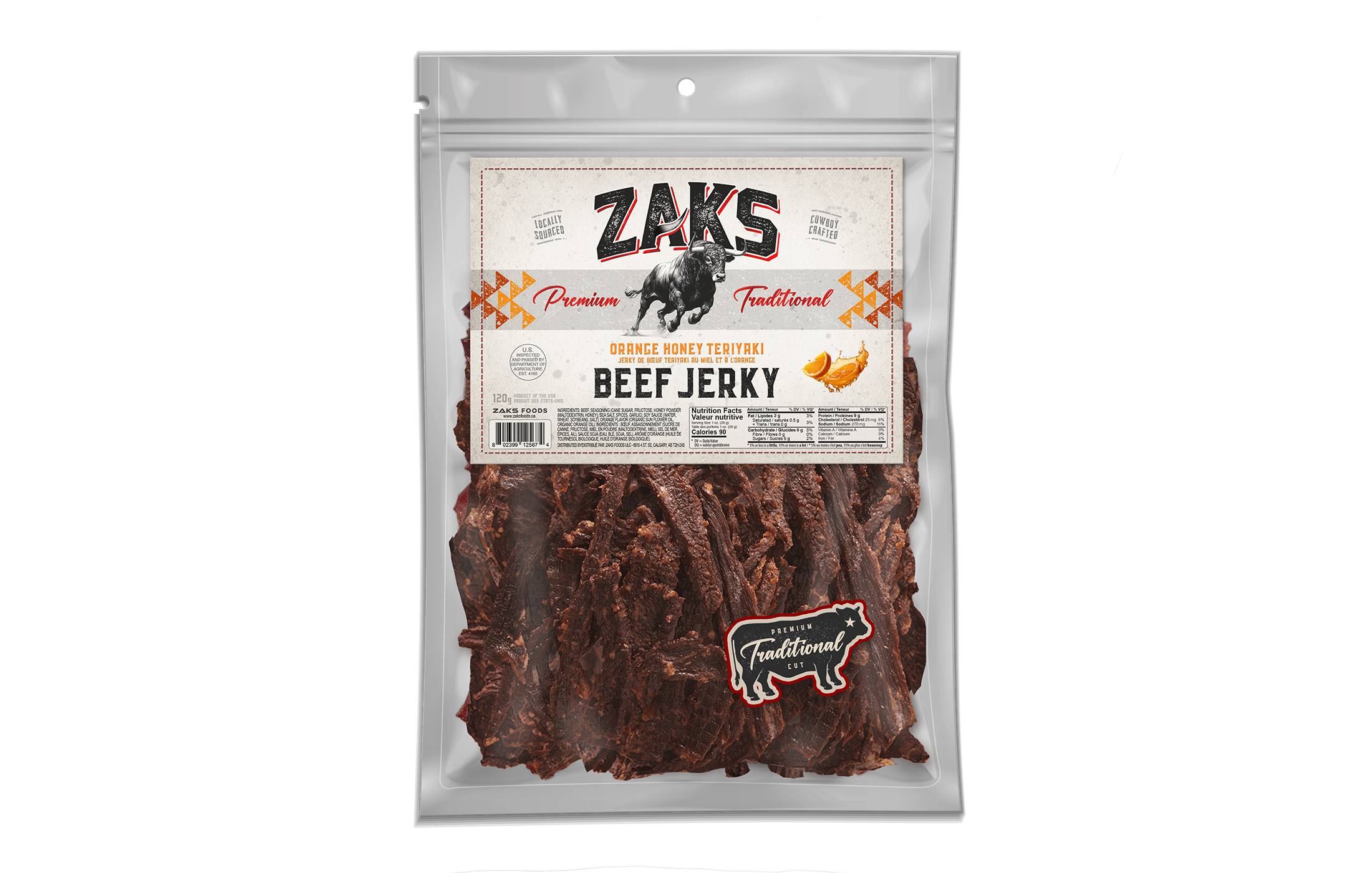
Zaks Traditional Jerky USA (various)
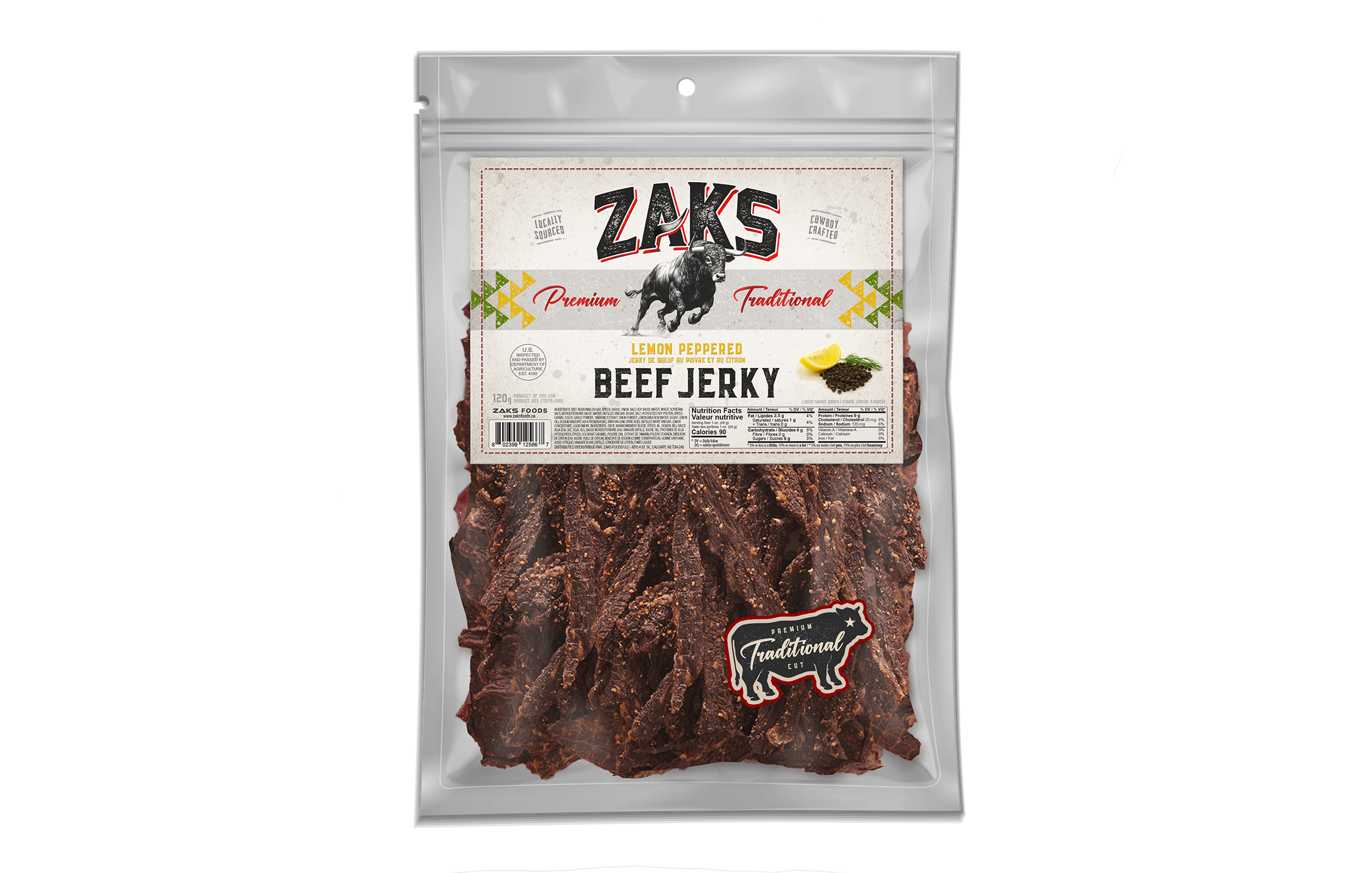
Zaks Traditional Jerky USA (various)
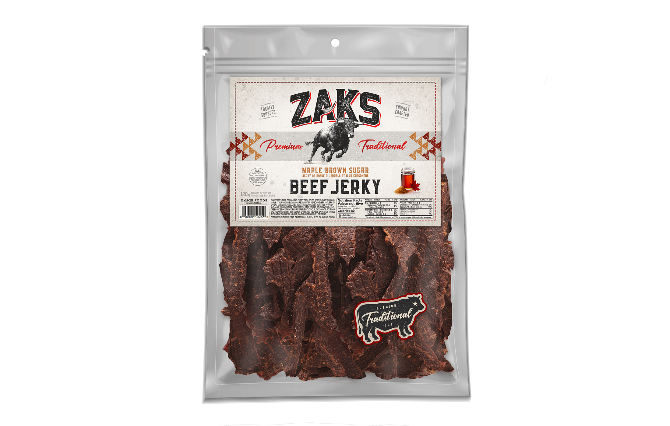
Zaks Traditional Jerky USA (various)
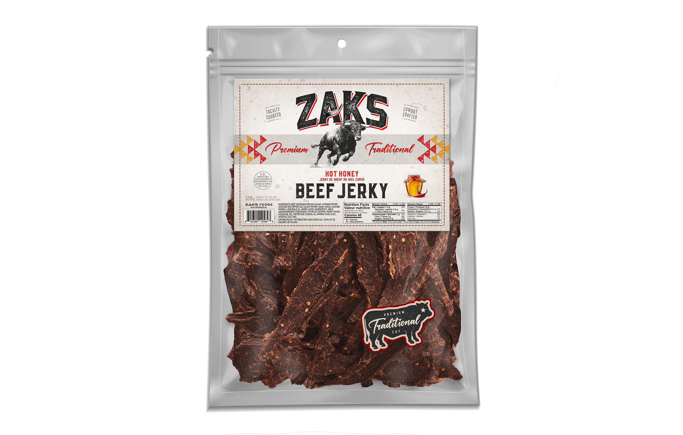
Zaks Traditional Jerky USA (various)
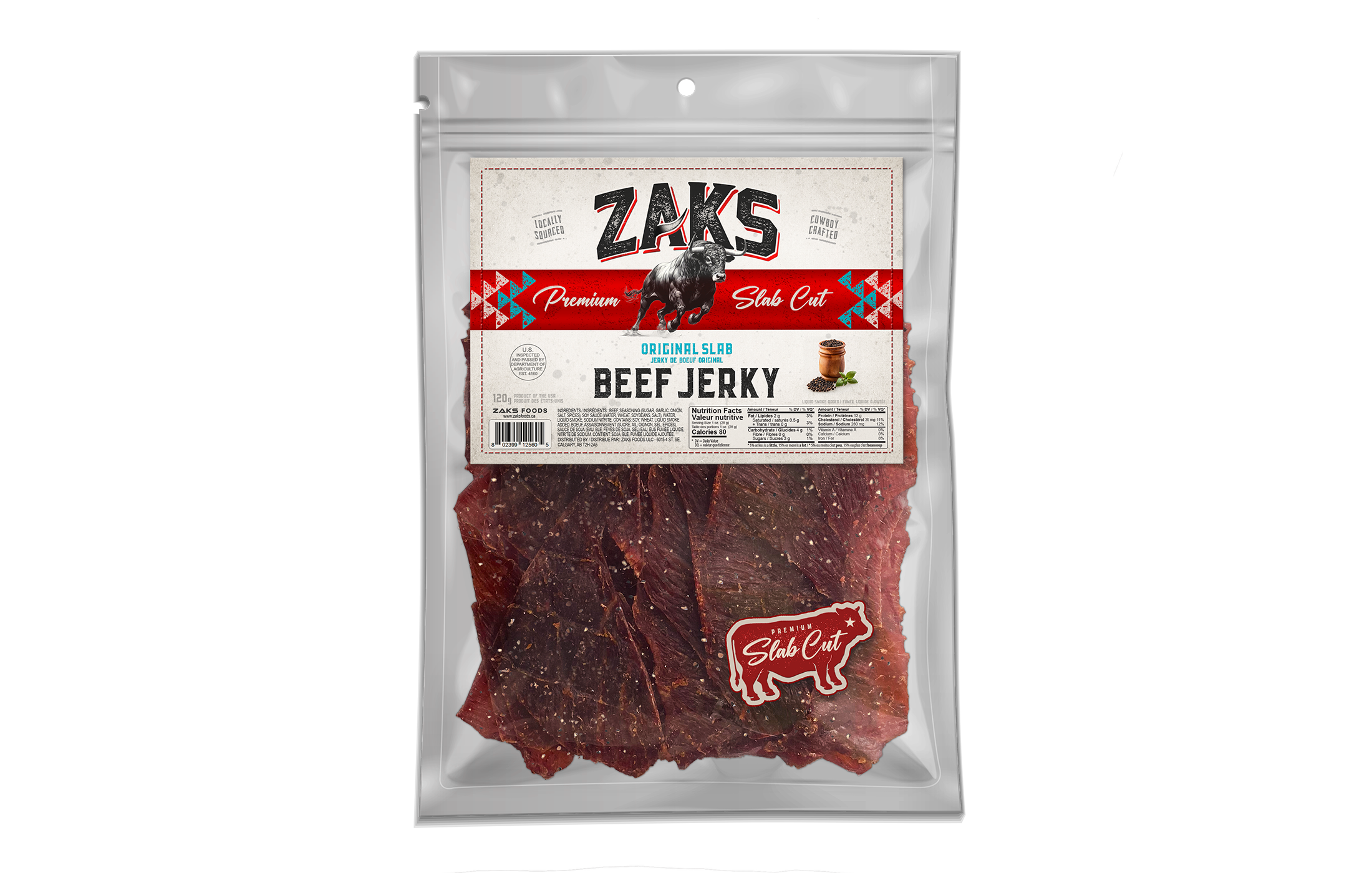
Zaks Slab Jerky USA (various)
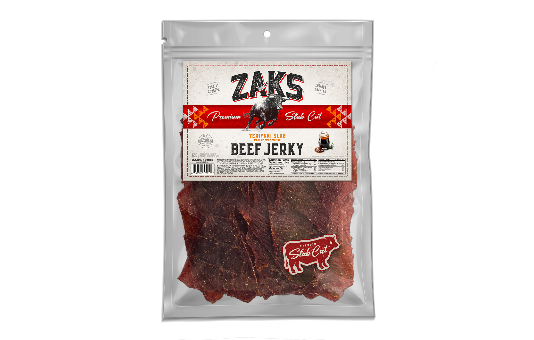
Zaks Slab Jerky USA (various)
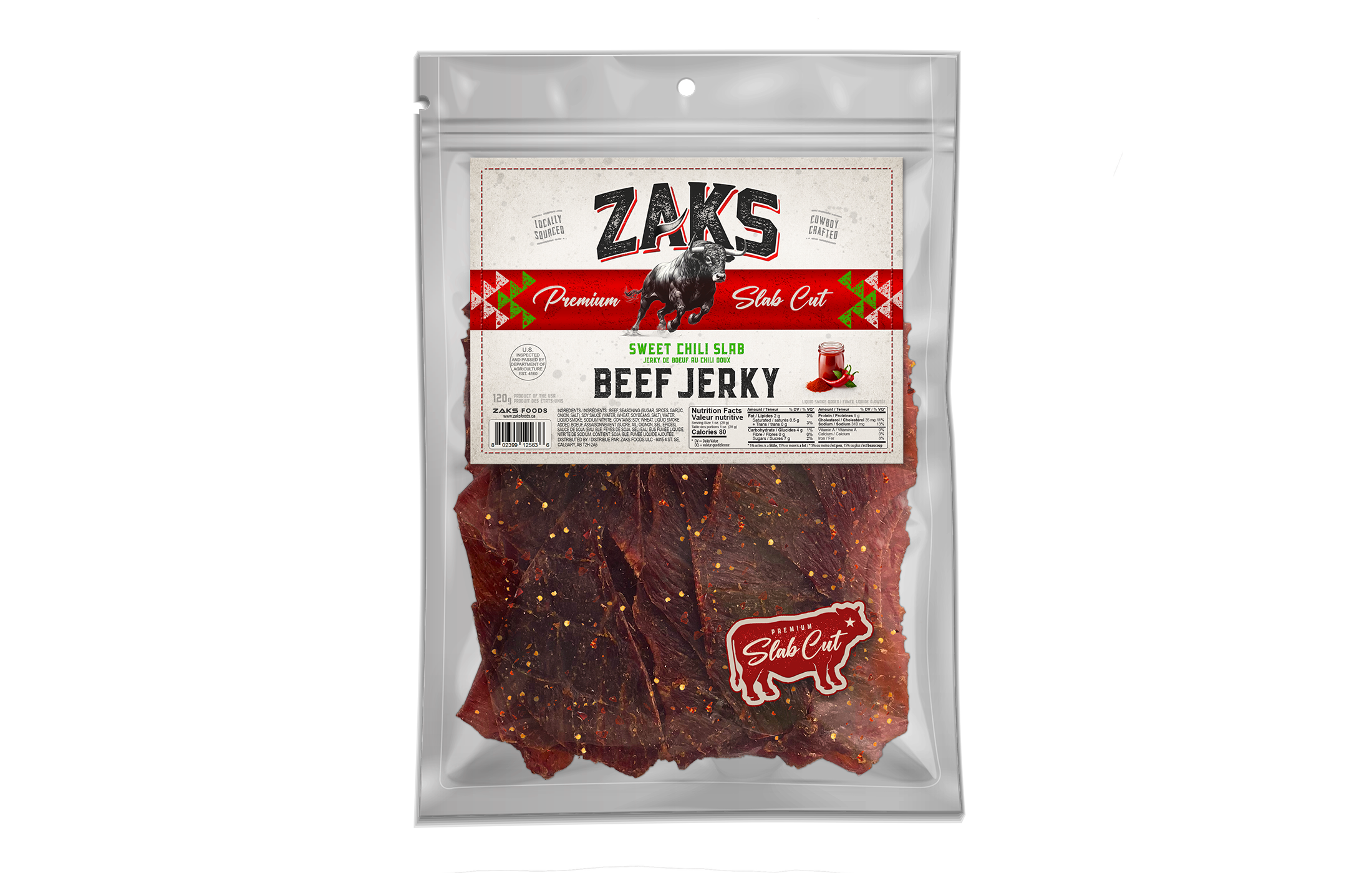
Zaks Slab Jerky USA (various)
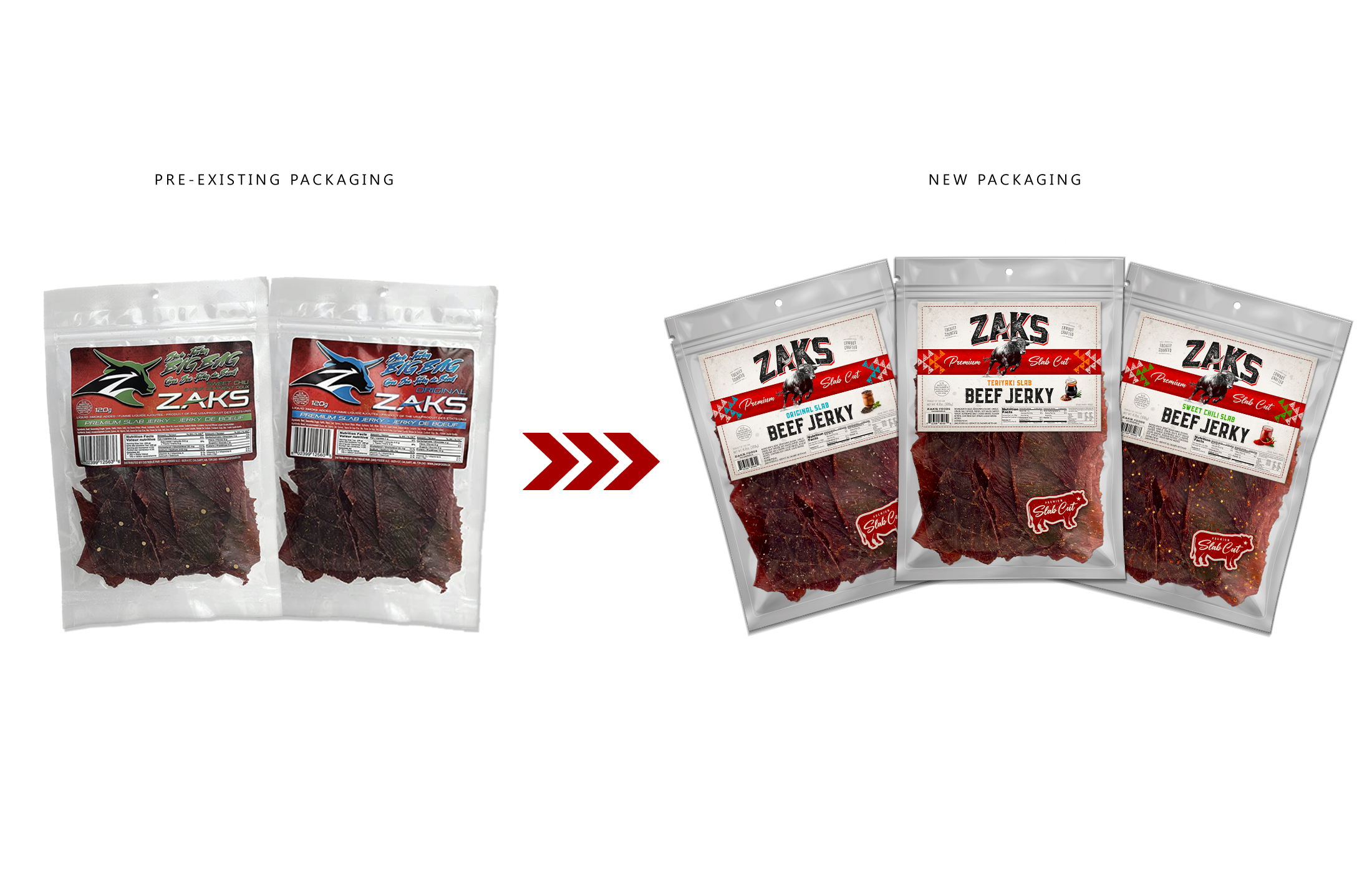
Before (Previous Labels) vs. After (Rebranded Labels)
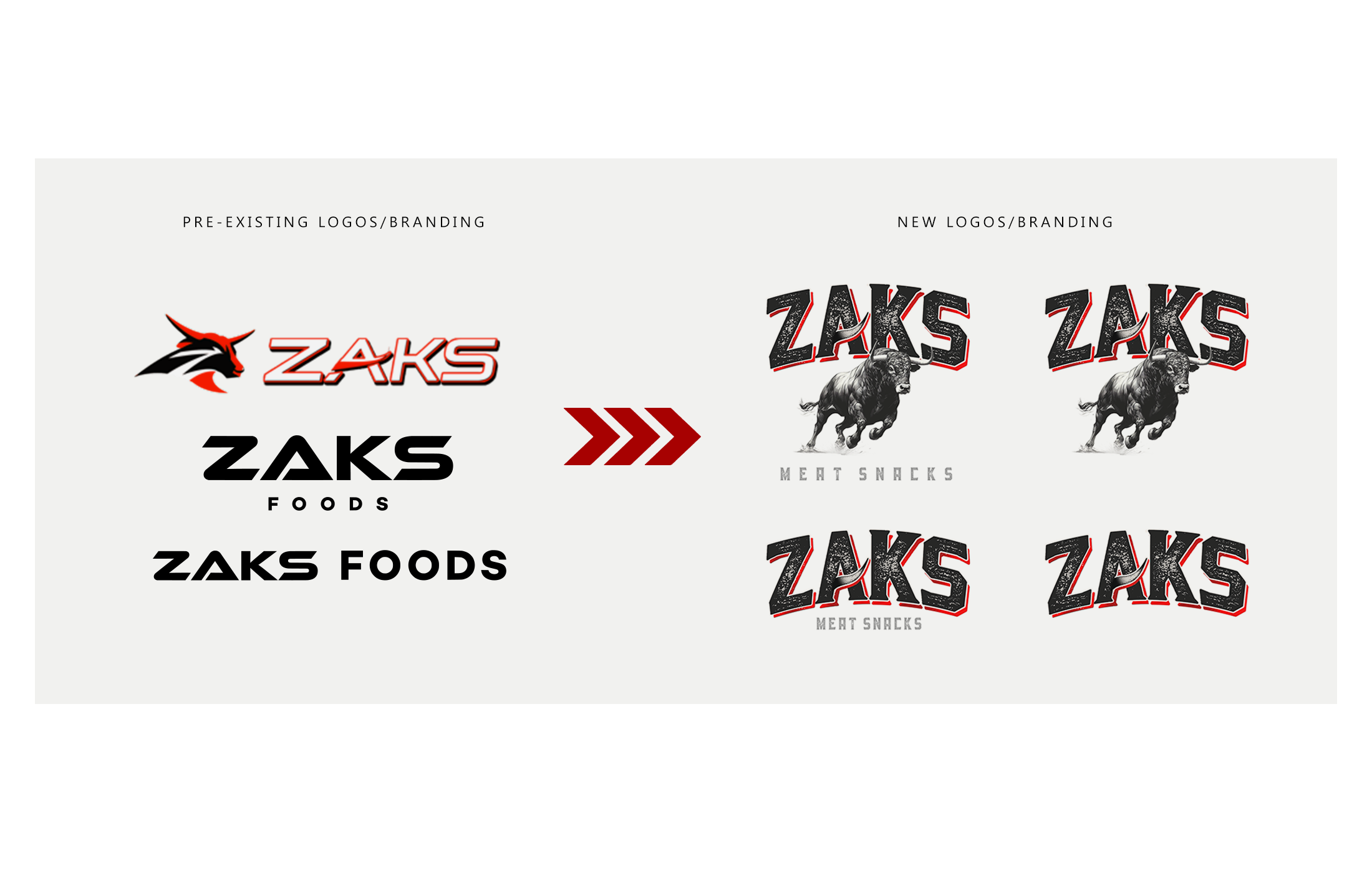
Zaks Beef Jerky Logos - Before / After